


Valentino 2014
Designers Maria Grazia Chiuri and Pierpaolo Piccioli choose classical music and literature to inspire their collections for years. In 2014, Valentino picked 55 different operas to make 55 different dresses. In this collection, we can see many different textures from wools, fringe and chiffons. There are hard strong lines and soft flowing lines, which would represent the different feeling we get from each of the different operas. We also see this hard theme on pieces with the lion face color blocking, which are featured on thicker fabrics. The soft theme is seen on more delicate fabrics with lace and beadwork. Colors for this collection are very deep with low saturation. All the colors have the same intensity, a very little difference in value. This collection uses grey as a neutral color.
Valentino 2015
Again Valentino sets the mood with classic literature and this time, Russian art so with a little more romance. We can see written words swirled throughout these pieces. The Russian painter’s heritage is seen through the use of the floral lace baroques and embroidered embellishments. The designers say, “You fly when you are in love” whether be in the day or in the night. The flowing lines of the long dress insinuates flying. The darkness of midnight blue with gold sequins represents the night and the lightness of sea foam green with lace baroque represents the day. The over-all color palette has a diversity of hues. Beiges are used as the neutral color and then we see rich reds that scream romance. There is harmony of bright colors with muted colors to create a balance.
Valentino’s theme of romance in literature, art and music are very similar between 2014 and 2015. Both seasons have a variety of textures: some similar and some different. The colors from 2014 to 2015 transition from a deep low saturation to a bright high saturation. The colors become warmer and more romantic in 2015 building on the theme of romance.
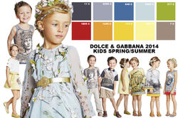
Dolce and Gabbana Kids Collection 2014
D&G introduced kids wear in Fall/Winter 2013. D&G kid’s collection usually compliments their Mens and Womens ready to wear collections.
In 2014, D&G used Ancient Greece for inspiration. The collection is very light and uses a lot of pastels. Graphic images are paired with decorative motif seen in the shift dresses. Bright colors are added to the dress trim to give a playful youthful vibe. The boys have a very neutral palette of greys and tans, which adds more emphasis on the girls. The girls have a 3D element to them seen with the leaves and flowers of the blue dress and the coin pieces on the shoulders of the girls shirt. The color palette has a good balance of warm and cold colors and has a high saturation in the primary colors.
D&G Kids Collection 2015
This year’s collection is very vivid and alive. D&G was inspired by Spain from the matadors and bulls to the seaports of Gibraltar. Polka dots are a main element and add the playful youthful vibe especially with the boy’s jacket and t-shirt sleeves. Another element of youth is the mixture of patterns; graphic prints with plaids and floral prints with large gingham and stripes. There is a high contrast in color in this collection. There is the classic high contrast of black and white. There is also the contrast of the black paired with a pastel pink, which also creates a transparency for the pink, making the pink look darker and further back. The collection also highlights complementary colors of green and red or purple, which creates harmony.
D&G Kids Collection between 2014 and 2015 are very different in theme and color. Especially in the boys, the 2015 collection have more hues instead of just neutrals. The high contrast and complementary colors in the girl’s collection for 2015 give a sense of sophistication compared to the young feeling of the 2014 collection. The 2014 collection feels almost like “dress up clothes” because the entire color wheel is being played.